# switch
# 概述
开关选择
# 子组件
不支持
# 属性
支持通用属性
| 名称 | 类型 | 默认值 | 必填 | 描述 |
|---|---|---|---|---|
| checked | <boolean> | false | 否 | 可触发 checked 伪类(checked 伪类样式还未支持) |
# 样式
支持通用样式
| 名称 | 类型 | 默认值 | 必填 | 描述 |
|---|---|---|---|---|
| thumb-color | <color> | #ffffff 或者 rgb(255, 255, 255) | 否 | 滑块颜色 |
| track-color | <color> | #0d84ff 或者 rgb(13, 132, 255) | 否 | 滑轨颜色 |
# 事件
支持通用事件
| 名称 | 参数 | 描述 |
|---|---|---|
| change | {checked:checkedValue} | checked 状态改变时触发 |
# 示例代码
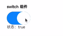
<template>
  <div class="page">
    <text class="title">switch 组件</text>
    <switch checked="{{ switchValue }}" class="switch" @change="onSwitchChange"></switch>
    <text>状态:{{ switchValue }}</text>
  </div>
</template>

<script>
  export default {
    private: {
      switchValue: true
    },
    onSwitchChange(e) {
      this.switchValue = e.checked
    }
  }
</script>

<style>
  .page {
    flex-direction: column;
    padding: 30px;
    background-color: #ffffff;
  }

  .title {
    font-weight: bold;
  }

  .switch {
    width: 100px;
    margin-top: 10px;
  }
</style>