# 页面样式与布局
# 盒模型
JS 应用布局框架使用 border-box 模型,具体表现与宽高边距计算可参考 MDN 文档box-sizing (opens new window),暂不支持 content-box 模型与手动指定 box-sizing 属性。
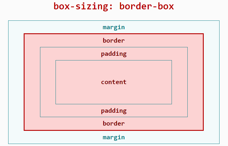
布局所占宽度 Width:
Width = width(包含padding-left + padding-right + border-left + border-right)
布局所占高度 Height:
Height = height(包含padding-top + padding-bottom + border-top + border-bottom)
# 长度单位
框架对长度单位的支持,支持长度单位px、%、dp。
# px
与传统 web 页面不同,px是相对于项目配置基准宽度的单位,已经适配了移动端屏幕,其原理类似于rem。
开发者只需按照设计稿确定框架样式中的 px 值即可。
首先,我们需要定义项目配置基准宽度,它是项目的配置文件(<ProjectName>/src/manifest.json)中config.designWidth的值,默认不填则为 480。
然后, 设计稿1px与框架样式1px转换公式如下:
设计稿1px / 设计稿基准宽度 = 框架样式1px / 项目配置基准宽度
示例如下:
若设计稿宽度为 640px,元素 A 在设计稿上的宽度为 100px,实现的两种方案如下:
方案一:
修改项目配置基准宽度:将项目配置基准宽度设置为设计稿基准宽度,则框架样式1px等于设计稿1px
- 设置
项目配置基准宽度,在项目的配置文件(<ProjectName>/src/manifest.json)中,修改config.designWidth:
{
  "config": {
    "designWidth": 640
  }
}
- 设置元素 A 对应的框架样式:
width: 100px;
方案二:
不修改项目配置基准宽度:若当前项目配置的项目配置基准宽度为 480,设元素 A 的框架样式 xpx,由转换公式得:100 / 640 = x / 480。
- 设置元素 A 对应的框架样式:
width: 75px;
# 百分比%
JS 应用的百分比计算规则与 css 类似,可参考MDN 文档 (opens new window)。
# dp3+
dp 单位,全称为 device independent pixels,即设备独立像素。
计算公式:dp 数值 = 物理分辨率 / 设备像素比(device pixel ratio)
举例:一个设备分辨率为 480*480,设备像素比 = 2,屏幕宽度 = 480 像素 = 240dp
示例代码:
<style>
  .dp-box{
    width:360dp;
    height:360dp;
    background-color:green;
    margin-bottom:40px;
  }
</style>
# 设置定位
position 支持2种属性值:relative、absolute,并且默认值为 relative,可以参考MDN 文档 (opens new window)。
# 设置样式
开发者可以使用内联样式、tag选择器、class选择器、id选择器来为组件设置样式
同时也可以使用并列选择设置样式,暂时不支持后代选择器。
详细的文档可以查看此处。
示例如下:
<template>
  <div class="page">
    <text style="color: #FF0000;">内联样式</text>
    <text id="title">ID选择器</text>
    <text class="title">class选择器</text>
    <text>tag选择器</text>
  </div>
</template>

<style>
  .page {
    flex-direction: column;
  }
  /* tag选择器 */
  text {
    color: #0000FF;
  }
  /* class选择器(推荐) */
  .title {
    color: #00FF00;
  }
  /* ID选择器 */
  #title {
    color: #00A000;
  }
  /* 并列选择 */
  .title, #title {
    font-weight: bold;
  }

</style>
# 通用样式
通用样式如 margin,padding 等属性可以点击此处查询。
# Flex 布局示例
框架使用Flex布局,关于Flex布局可以参考外部文档A Complete Guide to Flexbox (opens new window)。
Flex布局的支持也可以在官网文档的通用样式查询。
div 组件为最常用的 Flex 容器组件,具有 Flex 布局的特性;text、span组件为文本容器组件,其它组件不能直接放置文本内容。
示例如下:
<template>
  <div class="page">
    <div class="item">
      <text>item1</text>
    </div>
    <div class="item">
      <text>item2</text>
    </div>
  </div>
</template>

<style>
  .page {
    /* 交叉轴居中 */
    align-items: center;
    /* 纵向排列 */
    flex-direction: column;
  }
  .item {
    /* 有剩余空间时,允许被拉伸 */
    /*flex-grow: 1;*/
    /* 空间不够用时,不允许被压缩 */
    flex-shrink: 0;
    /* 主轴居中 */
    justify-content: center;
    width: 200px;
    height: 100px;
    margin: 10px;
    background-color: #FF0000;
  }
</style>
# 动态修改样式
动态修改样式有多种方式,与传统前端开发习惯一致,包括但不限于以下:
- 修改 class:更新组件的 class 属性中使用的变量的值
- 修改内联 style:更新组件的 style 属性中的某个 CSS 的值
- 修改绑定的对象:通过绑定的对象控制元素的样式
示例如下:
<template>
  <div style="flex-direction: column;">
    <!-- 修改 class -->
    <text class="normal-text {{ className }}" onclick="changeClassName">点击我修改文字颜色</text>
    <!-- 修改内联 style -->
    <text style="color: {{ textColor }}" onclick="changeInlineStyle">点击我修改文字颜色</text>
    <!-- 修改绑定的对象 -->
    <text style="{{ styleObj }}" onclick="changeStyleObj">点击我修改文字颜色</text>
  </div>
</template>

<style>
  .normal-text {
    font-weight: bold;
  }
  .text-blue {
    color: #0faeff;
  }
  .text-red {
    color: #f76160;
  }
</style>

<script>
  export default {
    private: {
      className: 'text-blue',
      textColor: '#0faeff',
      styleObj: {
        color: 'red'
      }
    },
    onInit () {
      console.info('动态修改样式')
    },
    changeClassName () {
      this.className = 'text-red'
    },
    changeInlineStyle () {
      this.textColor = '#f76160'
    },
    changeStyleObj () {
      this.styleObj = {
        color: 'yellow'
      }
    }
  }
</script>
# 引入 less/scss 预编译
# less 篇
less 语法入门请参考less 中文官网 (opens new window)。
使用 less 请先安装相应的类库:less、less-loader:
npm i less less-loader
详见文档样式语法 --> 样式预编译;然后在<style>标签上添加属性lang="less" 示例如下:
<template>
  <div class="page">
    <text id="title">less示例!</text>
  </div>
</template>
<style lang="less">
  /* 引入外部less文件 */
  @import './style.less';
  /* 使用less */
</style>
# scss 篇
scss 语法入门请参考scss 中文官网 (opens new window)。
使用 scss 请在JS 应用项目下执行以下命令安装相应的类库:node-sass、sass-loader:
npm i node-sass sass-loader
详见文档style 样式 --> 样式预编译;然后在<style>标签上添加属性lang="scss"。
示例如下:
<template>
  <div class="page">
    <text id="title">less示例!</text>
  </div>
</template>

<style lang="scss">
  /* 引入外部scss文件 */
  @import './style.scss';
  /* 使用scss */
</style>
# 使用 postcss 解析 css
JS 应用支持 postcss 来解析 css,postcss 可以采用类似 less,sass 的语法来解析 css 了,比如支持变量,嵌套,定义函数等功能了。
使用 postcss 解析 css 分为 3 个步骤:
1.安装对应的 loader:
npm i postcss-loader precss@3.1.2 -D
2.在项目的根目录新建一个 postcss.config.js,增加如下内容:
module.exports = {
  plugins: [require('precss')]
}
其中 precss 为 postcss 的插件。
3.在页面对应的 style 标签上增加 lang="postcss",如下:
<style lang="postcss">
  /* 使用postcss */
  .page {
    justify-content: center;
    background-color: #00beaf;
  }

  #title {
    color: #FF0000;
  }
</style>
这样就可以在 css 里面书写对应的代码了。
说明
如果想支持更多的语法格式,可以在 postcss.config.js 文件里面添加更多的插件,关于 postcss 的插件见插件地址 (opens new window)。