# Multi-screen Design
# Xiaomi Smart Wearable Devices
Currently, Xiaomi wearable devices equipped with the Vela system are primarily smartwatches and wristbands. The watch screens are circular or rectangular, while the wristband screens are mainly rectangular and capsule-shaped.
Data reference for released Vela wearable devices:
| Device Type | Device Model | Screen Shape | Screen Size | Resolution | PPI | DPR |
|---|---|---|---|---|---|---|
| Watch | Xiaomi Watch S1 Pro | Circular | 1.47 inches | 480x480 | 326 | 2.0 |
| Watch | Xiaomi Watch H1 | Circular | 1.43 inches | 466x466 | 326 | 2.0 |
| Watch | Xiaomi Watch S3 | Circular | 1.43 inches | 466x466 | 326 | 2.0 |
| Watch | Xiaomi Watch S4 Sport | Circular | 1.43 inches | 466x466 | 326 | 2.0 |
| Watch | Xiaomi Watch S4 | Circular | 1.43 inches | 466x466 | 326 | 2.0 |
| Watch | REDMI Watch 5 | Rectangular | 2.07 inches | 432x514 | 324 | 2.0 |
| Wristband | Xiaomi Wristband 8 Pro | Rectangular | 1.74 inches | 336x480 | 336 | 2.1 |
| Wristband | Xiaomi Wristband 9 | Capsule-shaped | 1.62 inches | 192x490 | 325 | 2.0 |
| Wristband | Xiaomi Wristband 9 Pro | Rectangular | 1.74 inches | 336x480 | 336 | 2.1 |
| Wristband | Xiaomi Wristband 10 | Capsule-shaped | 1.725 inches | 212x520 | 326 | 2.0 |
| Watch | Xiaomi Watch S5 | Circular | 1.485 inches | 480x480 | 323 | 2.0 |
# Design Recommendations
When integrating products, design decisions can be made based on application scenarios and adaptable product forms. If the product scenario allows for good interaction across various screen forms such as wristbands and watches, it is recommended to create three types of design drafts to accommodate the interaction schemes for capsule-shaped, circular, and rectangular screens.
Data reference for different screen shapes:
| Screen Shape | Circular Screen | Rectangular Screen | Capsule Screen |
|---|---|---|---|
| Aspect Ratio Range | W/H=1 | 0.5<=W/H<1 | 0.3<W/H<0.5 |
| Recommended Aspect Ratio | 1 | 0.7 | 0.39 |
| Recommended Resolution | 466x466 | 336x480 | 192x490 |
It is recommended to design three sets of UI interactions to accommodate the three main screen types. If the circular and rectangular screens can be reused, one set can be designed for circular and rectangular screens, and another set for capsule screens.
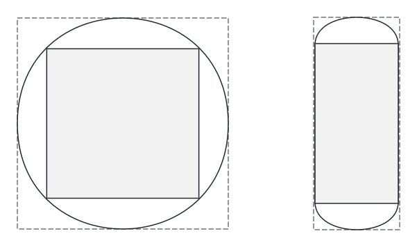
# Safe Area Adaptation for Curved Screens
For circular and capsule-shaped screens, the curved screen edges can cause display issues. When designing the UI, it is necessary to consider the safe area of the screen and design the main functions within the safe area.
For example, text display or content lists should consider the completeness and interactivity of display at the edges.
The gray areas in the illustration represent the safe areas for circular and capsule screens, respectively.