# swiper
# Overview
Slider view container.
# Child Components
Supported.
# Attributes
Supports Universal Attributes.
| Name | Type | Default | Required | Description |
|---|---|---|---|---|
| index | <number> | 0 | No | Index of the currently displayed child component |
| autoplay | <boolean> | false | No | Whether to automatically play after rendering |
| interval | <number> | 3000ms | No | Time interval for autoplay, in milliseconds |
| indicator | <boolean> | true | No | Whether to enable the indicator, default true |
| loop | <boolean> | true | No | Whether to enable loop mode |
| duration | <number> | - | No | Slide animation duration (duration is dynamically calculated based on finger speed by default) |
| vertical | <boolean> | false | No | Whether the slide direction is vertical, and the indicator is also vertical when it is |
| previousmargin | <string> | 0px | No | Front margin, can be used to expose a small part of the previous item, supports units: px and % |
| nextmargin | <string> | 0px | No | Rear margin, can be used to expose a small part of the next item, supports units: px and % |
| enableswipe | <boolean> | true | No | Whether to support gesture swiping on the swiper |
Note: The sum of previousmargin and nextmargin should not exceed 1/2 of the entire swiper size, and any excess will be truncated.
# Styles
Supports Universal Styles.
| Name | Type | Default | Required | Description |
|---|---|---|---|---|
| indicator-color | <color> | rgba(0, 0, 0, 0.5) | No | Indicator fill color |
| indicator-selected-color | <color> | #33b4ff or rgb(51, 180, 255) | No | Indicator color when selected |
| indicator-size | <length> | 20px | No | Diameter size of the indicator component |
| indicator-[top|left|right|bottom] | <length> | <percentage> | - | No | Position of the indicator relative to the swiper |
# Events
Supports Universal Events.
| Name | Parameters | Description |
|---|---|---|
| change | {index:currentIndex} | Triggered when the index of the currently displayed component changes |
| swipestart2+ | {index:currentIndex} | Triggered when the child component switching animation starts (if the switching is caused by finger dragging, it refers to the time point when the finger starts pressing and dragging) |
| swipeend2+ | {index:currentIndex} | Triggered when the child component switching animation ends |
# Methods
| Name | Parameters | Description |
|---|---|---|
| swipeTo | {index: number(specified position)} | Scroll the swiper to the specified index position |
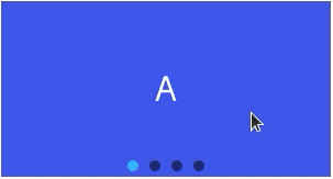
# Example Code
<template>
  <div class="page">
    <swiper class="swiper">
      <text class="item item-1">A</text>
      <text class="item item-2">B</text>
      <text class="item item-3">C</text>
      <text class="item item-4">D</text>
    </swiper>

  </div>
</template>

<style>
  .page {
    padding: 30px;
    background-color: white;
  }

  .swiper {
    width: 300px;
    height: 160px;
    indicator-size: 10px;
  }

  .item {
    text-align: center;
    color: white;
    font-size: 30px;
  }

  .item-1 {
    background-color: #3f56ea;
  }

  .item-2 {
    background-color: #00bfc9;
  }

  .item-3 {
    background-color: #47cc47;
  }

  .item-4 {
    background-color: #FF6A00;
  }
</style>