# Background Image Style
When adding an image as a background for a page component, developers can adjust the size, repetition pattern, and placement of the background image.
# background-size Property
This property defines the size of the background image.
The number of parameters can be one or two.
The valid parameter list is as follows:
| Parameter | Description |
|---|---|
contain | Scales the background image proportionally to fit entirely within the container, potentially leaving some blank space in the container (only as a single parameter). |
cover | Scales the background image proportionally to cover the entire container, potentially making some parts of the background image invisible (only as a single parameter). |
auto | Indicates that the original image size remains unchanged. Note that the original image size is in physical resolution, consistent with the resolution unit of a mobile phone screen, not the 1px length in JS applications. |
<length> | Describes the specific dimensions of the image in units of px or dp. Floating-point calculations are not supported; setting a floating-point value will be rounded down. |
<percent> | Describes the size of the image as a percentage of the corresponding dimension of the container. Floating-point calculations are not supported; setting a floating-point value will be rounded down. |
When there are two parameters, the first parameter is interpreted as the width along the horizontal axis, and the second parameter is interpreted as the height along the vertical axis. If there is only one parameter, auto is supplemented as the second parameter, and then parsed according to the rules for two parameters.
Invalid parameters are uniformly interpreted as the default value auto, which is the original image size.
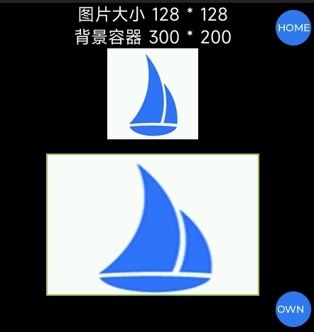
Example
<template>
  <div class="page">
    <text>Image size 128 * 128</text>
    <text>Background container 300 * 200</text>
    <image src= "../../common/logo.png">
    <div class="imgBg"></div>
  </div>
</template>
<style>
  .page {
    flex-direction: column;
    align-items: center;
    background-color: #000;
  }
  text {
    color: #fff;
    font-size: 24px;
  }
  .imgBg {
    width: 300px;
    height: 200px;
    margin-top: 20px;
    border: 2px solid yellowgreen;
    background-color: yellowgreen;
    background-image: url('../../common/logo.png');
    background-size: 300px 200px;
    background-repeat: no-repeat; // Not yet supported, recommended to include in case support is added later to prevent style display anomalies
  }
</style>
Effect
# background-repeat Property (Not yet implemented)
This property defines how the background image repeats within the component. The background image can repeat along the horizontal axis, vertical axis, both axes, or not at all.
The number of parameters is one.
The valid parameter list is as follows:
| Parameter | Description |
|---|---|
repeat | Repeats the image along both the horizontal and vertical axes. |
repeat-x | Repeats the image only along the horizontal axis. |
repeat-y | Repeats the image only along the vertical axis. |
no-repeat | Does not repeat the image. |
Invalid parameters are interpreted as the default value, which is repeat.
Example
<div class="container">
  <div class="img"></div>
</div>

<style>
  .container {
    width: 365px;
    height: 365px;
    background-color: #c7c7c7;
  }
  .img {
    width: 100%;
    height: 100%;
    background-image: url('../common/logo.png');
    /* Proportionally scales the background image to half the width of the component */
    background-size: 50%;
    /* Repeats the image along both the horizontal and vertical axes */
    background-repeat: repeat;
    /* Centers the background image within the component */
    background-position: center;
  }
</style>
.img {
  width: 100%;
  height: 100%;
  background-image: url('../common/logo.png');
  /* Proportionally scales the background image to a width of 100px */
  background-size: 100px;
  /* Does not repeat the background image */
  background-repeat: no-repeat;
  /* Positions the background image 20px from the left edge of the component and at a ratio of 3:7 from the top and bottom edges */
  background-position: left 20px top 30%;
}
# background-position Property
This property defines the position of the background image within the component.
It can be defined using 1-4 values. If two non-keyword values are used, the first value represents the horizontal position, and the second value represents the vertical position. If only one value is specified, the second value defaults to center. If three or four values are used, the length percentage values are offsets from the preceding keyword values.
Syntax for one value:
The value can be:
- The keyword
center, which centers the background image. - One of the keywords
top,left,bottom,right, which specifies which boundary to place the background image against. The other dimension is set to 50%, so the background image is centered in that dimension. <length>or<percentage>, which specifies the x-coordinate relative to the left boundary. The y-coordinate is set to 50%, centering the background image along the y-axis.
Syntax for two values:
One defines the x-coordinate, and the other defines the y-coordinate. Each value can be:
- One of the keywords
top,left,bottom,right. Ifleftorrightis given here, this value defines the x-axis position, and the other value defines the y-axis position. Iftoporbottomis given here, this value defines the y-axis position, and the other value defines the x-axis position. <length>or<percentage>. If the other value isleftorright, this value defines the y relative to the top boundary. If the other value istoporbottom, this value defines the x relative to the left boundary. If both values are<length>or<percentage>values, the first defines X, and the second defines Y.
Note:
If one value is top or bottom, the other value cannot be top or bottom. If one value is left or right, the other value cannot be left or right. That is, for example, top top and left right are invalid.
Ordering:
When pairing keywords, the position does not matter; writing top left or left top produces the same effect. When using <length> or <percentage> with a keyword, the order is important; the value defining X is placed first, followed by the value defining Y. right 20px and 20px right have different effects; the former is valid, but the latter is not. left 20% or 20% bottom are valid because the X and Y values are clearly defined and in the correct position.
The default value is left top or 0% 0%.
Syntax for three values:
Two values are keyword values, and the third is an offset from the preceding values:
- The first value is the keyword
top,left,bottom,right, orcenter. If set toleftorright, X is defined. If set totoporbottom, Y is defined, and the other keyword value defines X. <length>or<percentage>, if the second value, is an offset from the first value. If the third value, it is an offset from the second value.- A single length or percentage value is an offset from its preceding keyword value. A combination of one keyword with two
<length>or<percentage>values is invalid.
Syntax for four values:
The first and third values are keyword values defining X and Y. The second and fourth values are offsets from the preceding X and Y keyword values:
- The first and third values are keyword values
top,left,bottom, orright. If set toleftorright, X is defined. If set totoporbottom, Y is defined, and the other keyword value defines X. - The second and fourth values are
<length>or<percentage>. The second value is an offset from the first keyword. The fourth value is an offset from the second keyword.
Invalid parameters are all interpreted as the default value (0px, 0px), meaning the image is displayed in the top-left corner of the component.
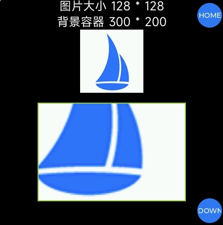
Example
<template>
  <div class="page">
    <text>Image size 128 * 128</text>
    <text>Background container 300 * 200</text>
    <image src= "../../common/logo.png">
    <div class="imgBg"></div>
  </div>
</template>
<style>
  .page {
    flex-direction: column;
    align-items: center;
    background-color: #000;
  }
  text {
    color: #fff;
    font-size: 24px;
  }
  .imgBg {
    width: 300px;
    height: 200px;
    margin-top: 20px;
    border: 2px solid yellowgreen;
    background-color: yellowgreen;
    background-image: url('../../common/logo.png');
    background-size: cover;
    background-position: right bottom;
    background-repeat: no-repeat; // Not yet supported, recommended to include in case support is added later to prevent style display anomalies
  }
</style>
Effect
# Support Details
| Device Product | Description |
|---|---|
| Xiaomi S1 Pro Sports Health Watch | Not supported |
| Xiaomi Band 8 Pro | Not supported |
| Xiaomi Band 9 / 9 Pro | Not supported |
| Xiaomi Watch S3 | Not supported |
| Redmi Watch 4 | Not supported |
| Xiaomi Wrist ECG Blood Pressure Monitor | Not supported |
| Xiaomi Band 10 | Supported |
| Xiaomi Watch S4 | Supported |
| REDMI Watch 5 | Supported |
| REDMI Watch 6 | Supported |
| Xiaomi Watch S5 | Supported |