# picker
# Overview
A scroll picker that currently supports two types of pickers: a normal picker and a time picker. The normal picker is used by default.
# Child Components
Not supported
# Attributes
Supports universal attributes
Normal picker
| Name | Type | Default Value | Required | Description |
|---|---|---|---|---|
| type | text | - | Yes | Dynamic modification is not supported. |
| range | Array<string> | - | No | Value range of the picker |
| selected | <number> | 0 | No | Default value of the picker. The value is the index of range. |
Time picker
| Name | Type | Default Value | Required | Description |
|---|---|---|---|---|
| type | time | - | Yes | Dynamic modification is not supported. |
| selected | <string> | Current time | No | Default value of the picker. The format is hh:mm. |
# Styles
Supports universal styles
| Name | Type | Default Value | Required | Description |
|---|---|---|---|---|
| color | <color> | Theme color | No | Font color of the candidate options |
| font-size | <length> | 30px | No | Font size of the candidate options, in px |
| selected-color | <length> | #ffffff | No | Font color of the selected option |
| selected-font-size | <length> | 20px | No | Font size of the selected option, in px |
| selected-background-color | <color> | - | No | Background color of the selected option |
# Events
Normal picker
| Name | Parameters | Description |
|---|---|---|
| change | {newValue:newValue, newSelected:newSelected} | Triggered when the scroll picker value is confirmed after selection. (newSelected is the index.) |
Time picker
| Name | Parameters | Description |
|---|---|---|
| change | {hour:hour, minute:minute} | Triggered when the scroll picker value is confirmed after selection. |
# Sample Code
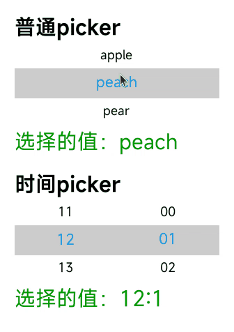
<template>
  <div class="page">
    <text class="title">Normal picker</text>
    <picker
      class="picker"
      type="text"
      range="{{pickerList}}"
      selected="1"
      onchange="onPickerChange">
    </picker>
    <text class="value">Selected value: {{v1}}</text>

    <text class="title">Time picker</text>
    <picker
      class="picker"
      type="time"
      selected="12:00"
      onchange="onTimePickerChange">
    </picker>
    <text class="value">Selected value: {{v2}}</text>
  </div>
</template>

<script>
  export default {
    private: {
      pickerList: ['apple', 'peach', 'pear', 'banana'],
      v1: 'peach',
      v2: '12:00'
    },
    onPickerChange(e) {
      this.v1 = e.newValue;
    },
    onTimePickerChange(e) {
      this.v2 = e.hour + ':' + e.minute;
    }
  }
</script>

<style>
  .page {
    flex-direction: column;
    padding: 30px;
    background-color: #ffffff;
  }

  .title {
    font-weight: bold;
    color: #000;
  }

  .value {
    margin-top: 5px;
    margin-bottom: 30px;
    color: #090;
  }

  .picker {
    font-size: 25px;
    color: #000;
    selected-font-size: 30px;
    selected-color: #09f;
    selected-background-color: #ccc;
  }
</style>