# input
# Overview
Provide an interactive interface to receive user input.
# Child Components
Not supported.
# Attributes
Common attributes are supported.
| Name | Type | Default Value | Required | Description |
|---|---|---|---|---|
| type | button | checkbox | radio | | button | No | Dynamic modification is supported. |
| checked | <boolean> | false | No | The checked status of the current component, which takes effect when the type is checkbox. It can trigger the checked pseudo-class (checked pseudo-class style is not supported yet). |
| name | <string> | - | No | The name of the input component. |
| value | <string> | - | No | The value of the input component. |
# Styles
Common styles are supported.
| Name | Type | Default Value | Required | Description |
|---|---|---|---|---|
| color | <color> | rgba(0, 0, 0, 0.87) | No | Text color |
| font-size | <length> | 37.5px | No | Text size |
| width | <length> | <percentage> | - | No | When the type is button, the default value is 128px. |
| height | <length> | <percentage> | - | No | When the type is button, the default value is 70px. |
# Events
Common events are supported.
| Name | Parameters | Description |
|---|---|---|
| change | Different types have different parameters. For details, see the parameters of the change event below. | Triggered when the value or status of the input component changes. When the type is button, there is no change event. |
# Parameters of the change Event
| Parameter | checkbox | radio | Remarks |
|---|---|---|---|
| name | √ | √ | - |
| value | √ | √ | - |
| checked | √ | - | - |
# Methods
| Name | Parameters | Description |
|---|---|---|
| focus | {focus:true|false}, if focus is not passed, the default value is true | Enable or disable the focus of the component. It can trigger the focus pseudo-class (focus pseudo-class style is not supported yet). |
# Example Code
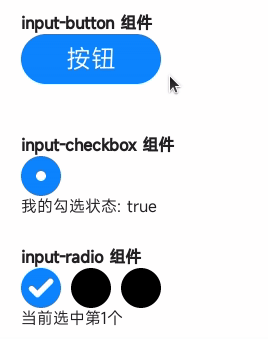
<template>
  <div class="page">
    <div class="section">
      <text class="title">input-button component</text>
      <input class="button" type="button" value="Button" @click="onButtonClick" />
      <text>{{ buttonText }}</text>
    </div>
    <div class="section">
      <text class="title">input-checkbox component</text>
      <input class="checkbox" type="checkbox" checked="{{ checkboxChecked }}" @change="onCheckboxChange" />
      <text>My checked status: {{ checkboxChecked }}</text>
    </div>
    <div class="section">
      <text class="title">input-radio component</text>
      <div>
        <input class="radio" type="radio" name="radio" value="1" checked="{{radioValue === '1'}}" @change="onRadioChange" />
        <input class="radio" type="radio" name="radio" value="2" checked="{{radioValue === '2'}}" @change="onRadioChange" />
        <input class="radio" type="radio" name="radio" value="3" checked="{{radioValue === '3'}}" @change="onRadioChange" />
      </div>
      <text>Currently, the {{ radioValue }}th one is selected.</text>
    </div>
  </div>
</template>

<script>
  export default {
    private: {
      buttonText: '',
      checkboxChecked: true,
      radioValue: '1'
    },
    onTextChange(e) {
      this.textValue = e.value
    },
    onButtonClick() {
      this.buttonText = 'The button is clicked.'
    },
    onCheckboxChange(e) {
      this.checkboxChecked = e.checked
    },
    onRadioChange(e) {
      this.radioValue = e.value
    }
  }
</script>

<style>
  .page {
    flex-direction: column;
    padding: 30px;
    background-color: #ffffff;
  }

  .section {
    flex-direction: column;
    margin-bottom: 30px;
  }

  .title {
    font-weight: bold;
  }

  .button {
    width: 140px;
    height: 50px;
    font-size: 25px;
    color: white;
  }

  .checkbox, .radio {
    width: 40px;
    height: 40px;
    margin-right: 10px;
  }
</style>